Target Circular Design
Type: Web Design
Team: Designer, Project Manager, and Creative Director
Target asked us to design a website for them to help evangelize their new internal protocols and certifications surrounding Circular Design. I’d been involved in numerous web design projects for Target (such as their corporate News and Features section) but this brief came with an unusual caveat: to completely ignore the existing Target visual identity and historical web design patterns in favor of something fresh, contemporary, and different.
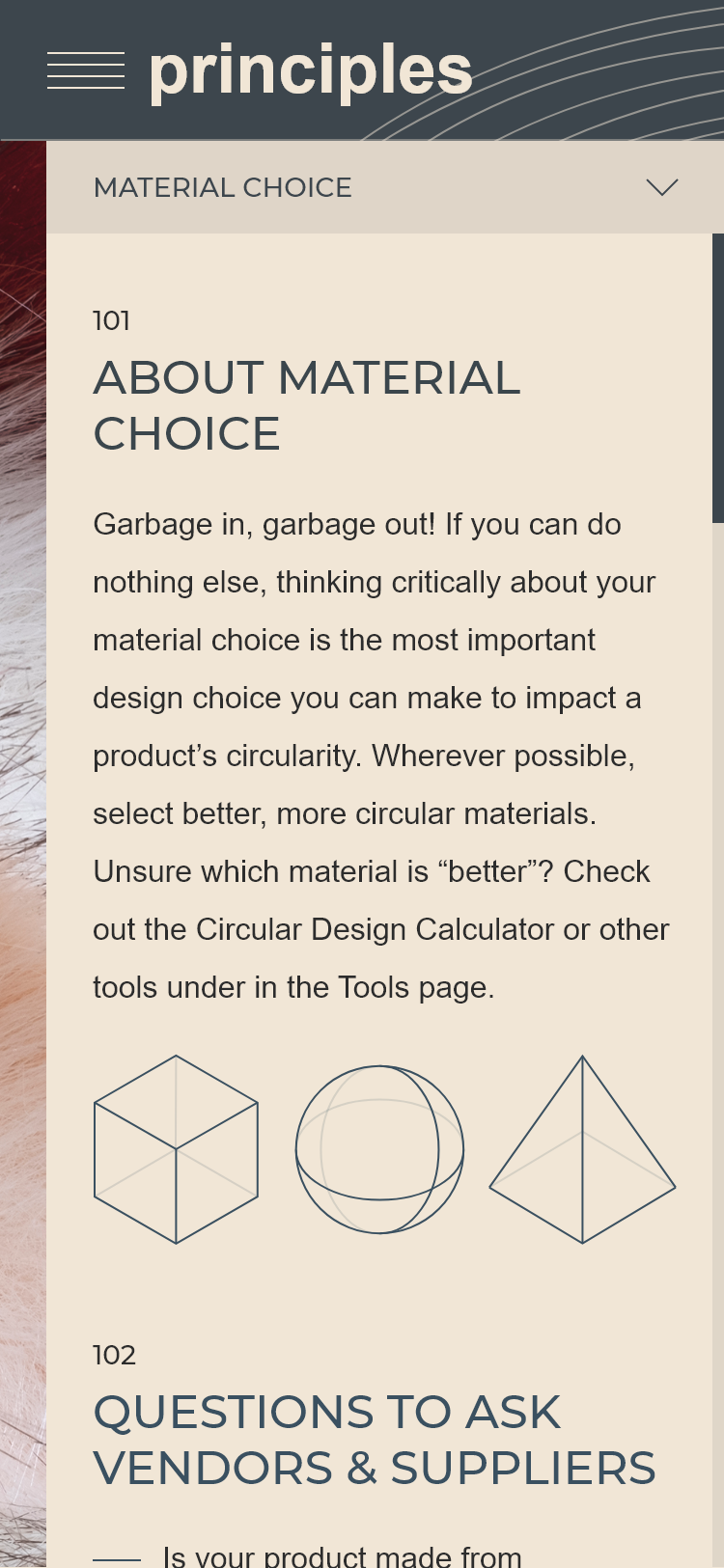
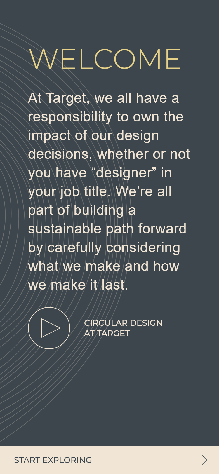
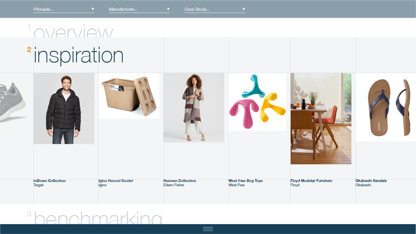
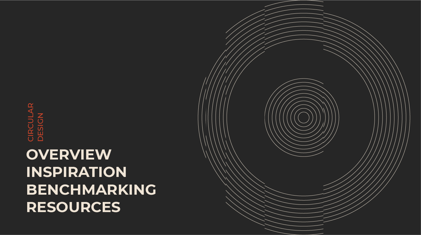
Target had already prepared a complete content map for the site. Since it was small and self-contained, we were given a lot of freedom to explore and experiment with interactions and visual design, as well as create original illustrations to accompany the written content. Ultimately we approached them with two distinct concepts for site navigation and visual design.
Concept 1: “Draftsman”


Concept 2: “Shadowbox”


Making a Decision
After several proposals, we arrived at the “Shadowbox” concept as the basis for our design, while incorporating the lightness and color direction from the “Draftsman” concept. The client was intrigued by the sliding shutter-like partitions used to transition between locations on the site and organize content, and split material photography in interesting and provocative ways. To our surprise, the client continued to encourage additional departure from the Target brand (such as the prominent, albeit stylized, use of the bullseye mark and #CC0000 “Target Red”).
On this advice, we continued to push and experiment with the design (while still keeping crucial accessibility requirements in mind) until we arrived at the designs below.
Final Designs